

Overview
Zinvest is an automated investment platform that provides financial advice and optimizes returns for individual, RIA (retirement investment accounts), and 401(k) rollover accounts. It wasn’t until recently, they closed the RIA section of the company to focus more on the brokerage app.
Tools Used
Figma, InVision, Adobe Illustrator and Photoshop
What did I do?
UX/UI Design - Research, Interaction Design, Visual Design, Prototype, Testing
Problem
Zinvest’s english website was mainly for RIA. All content had no relevant information to its brokerage app, and it was difficult to learn about the company.
Solution
Created a responsive website for beginner and advanced traders to learn more about Zinvest’s stock trading app and included resources to expand their knowledge in finance.
01. Research
Heuristic Evaluation
I observed Zinvest’s website by using Nielsen’s 10 Heuristics for Usability Method to identify any usability issues that could be updated.

Market Research
While using my market research document from the Zinvest App project, I began researching about the paint points and trends on fintech websites and websites in general.
"79% of consumers prefer live chats because they offer instant responses. Live chat has the highest consumer satisfaction rate at 92%."
"67% of users agree that web security is the most important aspect of a financial services website."
"76% of of affluent millennials will seek information about personal investing on a social network"
"Customers are concerned about the security of their data and want to be sure that a financial services website is completely error-free in all areas."
Viewing our Competitors
I focused the analysis on robot advisors and brokerage websites to observe the strengths and weaknesses among our competitors.
Direct Competitors


Indirect Competitors


Design Patterns
While observing the competitors, there were several design patterns that I found which will be implemented on Zinvest's website, so that it can keep up with its competitors.
📱
Mockups
Using images of devices to showcase products.
💬
FAQs
A page dedicated to all common questions people may have.
🖼
Illustrations
Providing a visual to make complicated information clear
💻
Desktop Platform
Being able to view the market through the desktop browser
User Interviews
I conducted in-person and remote 1-on-1 user interviews with 5 participants who had knowledge of investing and those who would like to learn. We focused the interview on their trading experiences and their thoughts when visiting financial websites.
💁🏻♀️
"So finances, there’s so much that could be covered in finance. So for me, what I look for is education, in a way."
💁🏽♂️
"Not everyone is on the same level, they would throw around a lot of terms on the site...not breaking it down for someone who’s trying to learn"
💁🏻♂️
"I go on About us and see their history, what they do, and what they’re currently working on, and sometimes that’s hard to find or impossible to find."
💁🏻
"I kind of like information for first time users... like How to Invest in this or What Does Investing Means, that kind of thing."
Empathy Map
To synthesize my findings, I transcribed my interview recordings and gathered the information into the empathy map. I observed the common patterns found and determined their insights and needs.
+ View Empathy Map

💻
Insight: People are not knowledgeable in investing
Need: People need to learn about investing
💬
Insight: People do not like reading a lot of text
Need: People need an easy way to consume information
🧐
Insight: People are curious about the services/products
Need: People need to research what the company offers
🔐
Insight: People are weary about giving out sensitive information
Need: People need to feel secure about their information.
💬
Insight: People have questions unanswered
Need: People need to have adequate support
Who are we designing for?
Jim represent one of our target market: The Learner. He is thinking about his future and would like to start investing, but he doesn't feel confident enough. Investing could be a scary thing to tackle, so he is taking it one step at a time to start learning how to invest smarter. Jim will help guide our design decision throughout the process.

02. Define
POV and HMW Questions
Creating the POV + HMW questions helped me define the problems that I was going to solve for Jim. Using these HMW questions, I can now start brainstorming solutions to our users problems.
Problem #1
How might we make it easy for Jim to learn more about investing?
Problem #2
How might we make it easy for Jim to digest complex information?
Problem #3
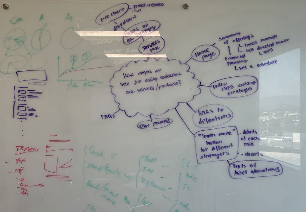
How might we help Jim easily understand our services/products?
Problem #4
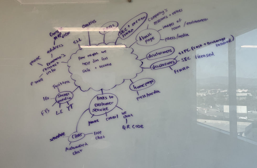
How might we help Jim feel secure about his personal information?
Brainstorming the Solutions
I conducted a mind map brainstorming session with my co-workers to come up with different solutions to Jim's problems. We timed ourselves for 3 minutes and generated as many solutions as possible within the time frame. We discussed the solutions among each other afterwards.

03. Ideate
Sitemap
I structured and organized Zinvest’s pages to ensure all content and pages are straightforward. My coworkers and I thought of how Jim would complete certain task with ease. It was a much bigger sitemap before, but we were able to remove certain pages and condense it even more.

Low-Fidelity Wireframes
I created low-fidelity wireframes on Figma to quickly layout and structure out the website. I went through different iterations until we reached a conclusion. The website was originally created for trading, financial planning, retirements, and robo-advisor, but that all changed when most those sectors were removed.


Branding
To ensure that the visuals were consistent with the brokerage app, I utilized our brand guidelines to ensure that the elements matches with our brand attributes - Fun, Growth, Helpful, Professional, and Simple.


Hi-Fidelity Wireframes
Due to the deadlines, I did not have the chance to create mid-fidelity wireframes. Referring to my lo-fi's, I created hi-fidelity wireframes and prototyped it in Figma to prepare for the usability test.


04. Testing
Usability Test
I conducted 3 moderated in-person and 3 moderated remote think aloud usability tests with 6 participants through Zoom and Skype. Most participants finished each tasks with ease, where some had some trouble finding certain buttons. All feedback were recorded and transcribed.
👱🏼♀️
"I would kind of expect to see ‘About Us’ or something, that’s what I usually see to learn more about the company."
👩🏻
"That section (rewards) was huge on the front page that’s how I remembered where it was. I would say that it might be a little too big..."
🧔🏻
"...I didn’t have to click anywhere but scroll down to Security. It was a little bit of scrolling..."
🧑🏻
"...something more at the top navigation, like “Earn free Stocks” or something, that might prompt them to join and share it..."
05. Iterate
Identifying Patterns - Affinity Map
I synthesize my notes into an affinity map to identify any patterns. Each tasks were rated by difficulty to see which tasks people had trouble with, and update the screens based on the feedbacks. There were some confusions with certain key terms and issues about the spacing, but nothing too major.
Patterns Discovered
Learn Tab

Excessive Scrolling

Big Gift Box Section

Company Tab

Unable to locate Zinvest's security info.

Free Stocks

Insight #1
6 out of 6 participants mistaken 'Learn' for another page
Rename 'Learn' to 'Resources'
Insight #2
5 out of 6 participants suggests to have 'About Us' tab than 'Company' tab
Rename 'Company' to 'About'
Insight #3
3 out of 6 participants felt like there's a lot of scrolling on the homepage
Decrease image size and white space
Insight #4
4 out of 6 participants had a hard time locating how Zinvest protects their account
Update the graphic to make it clear that it's security related
Note
I went back to my transcripts and considered several recommendations, such as, highlighting Free Stocks in the nav bar and decrease the gift box section. I wanted to take the recommendations into consideration even though they weren't common patterns.
Design Iterations
I gathered all the insights and recommendations from the affinity map to make updates to the website. This ensures that the complications participants had during the test would be fixed.
01 Navigation Bar
The Login and Get Started buttons were removed since the developers did not have the time to developed that feature. Based on our feedback, the 'Comapny' tab was changed to 'AboutUs' to make it more obvious to what it is. Thinking about the business goal, we added a 'free stock' option in the navigation to entice people about our offers.
Before
After
02 Gift Box
From the usability test, participants were mentioning how there was a lot of scrolling on the Free Stock section, so we decrease the size to reduce the amount of scrolling.
Before

After

03 Security Image
The graphic for the security info has been updated to make it more easy for people to find out how Zinvest protects their account.
Before

After

06. Solution
Revisiting Jim's Problems
With the help of Jim, our persona, he has guide our design decision throughout the process. Towards the end of my design, I always revisit Jim's problems to ensure his problems were solved.
Problem #1
How might we make it easy for Jim to learn more about investing?
Through out the website, there are blogs, definitions, and FAQs for Jim to learn about.


Problem #2
How might we make it easy for Jim to digest complex information?
We tried to make the content very easy to understand and include definitions to words that Jim may not know.
Problem #3
How might we help Jim easily understand our services/products?
The homepage highlights all of our services on one page, if he wants to learn more about each services/products, there will be a link for him to do so.


Problem #4
How might we help Jim feel secure about his personal information?
We have a security section on the homepage explaining how his money would be insured if anything happens. There are FAQs that goes in details about the security of his account.
Final Design

Conclusion
I had the opportunity to design a website for our stock trading app. It was a fun and challenging process, as we had a tight deadline. I had to learn how to manage my time well and communicated with our team in Beijing to ensure that all regulations were met.
Even though I was the only designer on the team, I had the help of my co-worker design several screens and fill in the content. I learned a lot from this process, and I will take what I experienced and leverage it in my next.
Next Steps
The next step is to hand over the design to the team in Beijing for feedback and discuss any technical difficulties with them before having it developed.
Explore Other Work


