
Overview
Scoops is a local ice cream shop that was established in 2005. It is located in Los Angeles and they currently have 3 locations which are located in Highland Park, Chinatown, and Torrance. It’s famed for its artisan ice cream and unique flavors.
Problem
With its popularity rising, Scoops currently does not have a website, and its online presence only includes a Yelp, Twitter and Instagram account.
Duration
2 weeks
Tools Used
Figma, InVision, Adobe Illustrator and Photoshop
What did I do?
UX/UI Design - Research, Interaction Design, Visual Design, Prototype, Testing
Solution
Designed a responsive website for customers to learn more about Scoops and its ice cream flavors, and to compete with more digital friendly ice cream shops.
* This is a speculative project and Scoops is a real business
Direct Competitors

Indirect Competitors
Design Patterns
While observing Scoops competitors, there were several design patterns that was discovered which could potentially be used on Scoops' website to give them a competitive edge in the market.
🖼
Customers' Pictures
Posting images of customers interacting with the business when using a hashtag.
📔
Online Menu
Having an online menu to give customers a look into what the business provides.
📍
Store Information
Informing the customers with details of its multiple locations.
💬
Testimonials
Showing customers’ testimonials to build credibility to the business.
Talking to our Potential Users
I conducted in-person and remote 1-on-1 user interviews with 5 customers' who's been to Scoops. Because of COVID-19, I was unable to talk to people at Scoops, but I got to interview some of my friends who’ve been to and has experienced Scoops.
💁🏻♀️
“I would appreciate pictures and prices, like general information about the place.”
💁🏽♂️
“It is important for me to know what's in my ice cream”
💁🏼
“I look to see if they have the flavors they reviewed and visit the shop to try those flavors.”
💁🏾♀️
“If there is an ice cream place that changes their flavor daily, then that’s the
only reason for me to go on their website if they change it often.”
Empathy Map
To synthesize my findings, I transcribed my interview recordings and gathered the information into the empathy map. I observed the common patterns found among Scoops' customers and determined their insights and needs.
Thinking + Feeling
Doing + Saying
Seeing
Hearing
Pains
Gains

Patterns Discovered
Research
Word of Mouth
Looking at Pictures
Reads Reviews
Environment

💻
Research
5 out of 5 do their research before picking a place to eat.
Customers need to be able to find information online.
💬
Reviews
5 out of 5 read reviews to get food recommendations through word-of-mouth.
Customers need to be able to know what people are saying about the place.
🖼
Images
3 out of 5 look at images online to help them make decisions.
Customers need to have images of what the ice cream shop offers.
📔
Online Menu
3 out of 5 search for menus online to learn more about the flavors.
Customers need to be informed about the menu items available online.
Who are we designing for?
I crafted a persona that represents one of Scoops’ target market: Millennial Digital Nomad. This is Carly, who embodies the millennial who loves to go to restaurants that are being raved about on social media. Creating Carly allowed me to reference her goals, needs, frustrations, and motivations, so that I could better empathize with users during my design process.

01. Research
Understanding the Market
I focused my research on the ice cream industry to gain insights as to the needs and frustrations of the potential and existing customers I would be designing for. I looked into the food industries, as ice cream was too niche, and discovered helpful insights on the trends, pain points, and demographics of the market.
“57% of those guests viewed restaurant websites before selecting where to dine.”
“Families with children and teenagers are the primary customer group for ice cream retailers”
“92% of consumers read online reviews”
“59% check ingredient labels before buying it for the first time”
Viewing our Competitors
To gain insights into the competition, I identified Scoops’ direct and indirect competitors to observe the strengths and weaknesses, and how they approach a similar problem. This research showed me how Scoops could best position itself to be a strong contender within its local market, utilizing the strengths and avoiding the weaknesses found among other ice cream shops.
02. Define
POV and HMW Questions
I framed the problem from Carly’s point of view to define the problems I was going to solve. I then translated these POV statements into HMW questions so that I could begin brainstorming solutions.
Problem #1
How might we help Carly access relevant information when she does her research about Scoops?
Problem #2
How might we make it easy for Carly to find online reviews on Scoops?
Problem #3
How might we share relevant images of Scoops for Carly to see?
Problem #4
How might we make it easy for Carly to access an online menu through Scoops?
Brainstorming the Solutions
I created a mind map to brainstorm new ideas to suggest solutions and offer me the chance to think of many ways to approach each problem. I timed myself for 3 minutes for multiple rounds for each HMW question and focused on generating as many solutions as possible.


Feature Roadmap
I gathered the solutions in the brainstorming activity and prioritized them in a list that would help me advocate for Carly, our persona, and make decisions that would be valuable for Scoops.

Structuring the Website - Sitemap
Because Scoops does not have a website, I structured and organize Scoops’ pages and features based on the insights that best fit Carly's needs and Scoop's potential customers. I thought through how Carly would navigate the website, and how she would be able to accomplish certain tasks as straightforward as possible.
Task Flow
To demonstrate how Carly would interact with Scoops’ website, I created three different tasks based on her needs to help define how she would go about researching more about Scoops, learning more about the ice cream ingredients, and finding more information on Scoops locations. This task flow helped me visualize the user experience and ensure that it was straightforward.

User Flow
I created a user flow to observe Carly’s thought process and all the potential paths she could take when completing her tasks, so I could design the screens to accommodate the different decisions.

Sketching Out the Pages
I sketched out the wireframes to quickly jot down my ideas, and structure Scoops’ website to show the most important information for Carly if she were to land on this page for the first time.
Home Page
About Us Page


Category Page
Product Details Page
Store Location Page
Mid Fidelity Wireframes
I digitized my mid-wireframes to help me visualize the layout, structure, and hierarchy of these pages before adding the visual elements and content.


Responsive Design
I created responsive wireframes to account for the different devices that users can access Scoops’ website - desktop, tablet, mobile - to ensure that layout is consistent and to create a better user experience.

03. Ideate
04. Testing
Preparing the Prototype
I created a prototype to observe how people interact with the website before adding visual elements and content. The prototype was created on InVision.
Usability Test
I tested the prototype with 6 participants, giving them 5 tasks to complete. All participants were able to complete the task successfully and with ease. As they carried their tasks, I recorded our conversations and documented their actions, comments, and feedback to synthesize these information later.
💁🏻♀️
“I would prefer all of the flavors on one page instead of on two pages because I might neglect the flavors on the second page.”
💁🏽♂️
“Everything was straightforward and I was able to find things easily.”
💁🏼
“I feel like I would want to know where the testimonials is coming from, is it Yelp, is it Google reviews, or is it Facebook?”
💁🏾♀️
“I mean having reviews of people would be good too, that’s something I would like at.”
05. Iterate
Synthesizing Information into the Affinity Map

Insight #1
4 out of 5 would like to see photos of the interior of Scoops
Include images of the interior of Scoops on the website
Insight #2
4 out of 5 would like to see photos of the exterior of Scoops
Include images of the exterior of Scoops on the website.
Insight #3
4 out of 5 would like to see photos of the ice cream flavors Scoops offers.
Include images of the ice cream flavor in Scoops’ online menu.
Note
Even though most of the insights were image related, I went back to my transcripts and considered several recommendations, such as, including customer reviews in the product details page and showing where the customers' testimonials are coming from. I wanted to take all recommendations into consideration even though they weren't common patterns.
Design
To ensure that Scoops’ brand was well-represented, I created a mood board on Pinterest to help guide my design decisions that aligned with Scoops’ brand attributes – unique, creative, modern, and inviting.


Design Iterations
After creating the hi-fidelity wireframes and receiving feedback from my mentor, I went back to my original design to make several adjustments.

Before

After
I updated the online menu to help distinguish the difference between the limited flavors and the standard flavors by including a star icon.

Before

After
The Flavors of the Week ice cream images have been updated to correlate with the online menu. I also added the name of the flavors to each images, so customers would know what the flavors are.
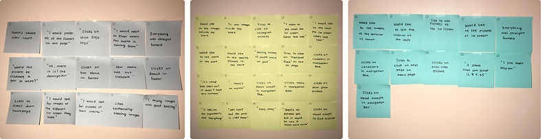
I collected my usability test findings into the affinity map to observe and gain insight in the common patterns. Many participants mentioned having images of the business would help them visualize what to expect at Scoops and to make decisions on what to get.
Participant #1
Participant #2
Participant #3
Participant #4
Participant #5
Participant #6

Patterns Discovered
Website is Straightforward
Images of Ice Cream
Successfully Completed All Tasks

Images of Interior
Images of Exterior
Images in Menu
06. Solution
Revisiting Carly's Problems
After creating our persona, there were several problems that Carly, our persona, faced that helped guide our design decisions throughout the design process.
Problem #1
How might we help Carly access relevant information when she does her research about Scoops?
When Carly gets on the homepage, she will see the Flavors of the Week right away and learn more about its flavors by clicking on it. She can also easily read up more about Scoops by navigating through the nav bar.


Problem #2
How might we make it easy for Carly to find online reviews on Scoops?
On the homepage, there are testimonials from previous customers where there are reviews for others to see. When viewing a flavor, Carly is able to view the ratings of each flavors.
Problem #3
How might we help Carly share relevant images of scoops for Carly to see?
Including images of the interior and exterior of Scoops gives Carly a good sense what to expect at the store. In the social media feature, it also allows her to view images from previous customers.


Problem #4
How might we make it easy for Carly to access an online menu through Scoops?
There are a couple ways for Carly to quickly and easily access Scoops' menu; through the nav bar and homepage.
Hi-Fidelity Wireframes


Explore Other Work


Conclusion
Given the fact that this project had a 2 week deadline, I learned to manage my time to stay on track and meet each deadline.
I learned how to create a responsive website for an existing business. Scoops does not have a website, I had to resort to their Yelp, Twitter, and Instagram account for information. This was a great challenge and experience to prepare me to work with other businesses in the future.
Next Steps
I will further test the high-fidelity prototype to gather more feedback to make new updates to Scoops' website.
Once the website has been updated and finalized, I will show the website to Scoops and discuss any possibility of having this site go live. Afterwards, I'll hand over the design to developers.